Intro
Welcome to 3 Degree of ILHS! a project to map out the social connections and friendships at innovation lab. it's a new way to look at the school and find just how interconnected we all are!
this project was inspired by the classic parlor game 7 degrees of kevin bacon where you try attempt to build a chain of people you've met to get to kevin bacon.
Get your data in
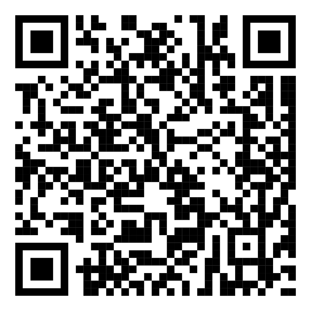
If you didn't fill out the form when it was in the bird call, you can do it now. Click here (school account) or scan the QR code below

About the graph
Connections on the graph are formed when
- One of the people lists the other as a close friend on the form
- One of the people lists the other as a person they frequently interact with outside their grade
In situations where people marked each other, those double connections were collapsed to a single connection
The coloring has two modes. The easiest to explain is grade. Grade simply colors based on the grade level people indicated on the form. Anyone that didn't submit the form is gray because there's no easy way to get grade data or guess someone's grade. If your name is gray you can fill out the form and be included properly in some future update!
The colors are as follows: Freshman are red, Sophomores are gold, Juniors are green, Seniors are blue, teachers are purple, and unknowns are gray
The other coloring mode is community. Community uses an algorithm to find similar clusters of nodes in the network (the library I use implements the multilevel algorithm). There's a bunch of different methods for finding communities but in the end they all give you a bunch of groupings. Each grouping was then assigned a color and that's what you see in the graph. Whenever you update the graph the communities and color assignments change, the color doesn't mean anything other than as a differentiator.
The initial dataset had a lot of names that were misspelled, missing last names, or non-existent. There was a lot of manual labor to go through the dataset and turn it into something usable like this. That being said there are likely mistakes, people with incorrect connections, missing last names, and missing people. If you aren't on this graph fill out the form and you will be added in a future update!
The last feature of the graph is highlighting. Highlighting is pretty simple, it just shows any connected nodes to the node you have hovered in white. If you click on that node you can then drag it around and see how the graph reforms.
Data Analysis
This section will contain a list of interesting findings from the data analysis of this graph. Most of these are just trivia, but they are still cool in my opinion.
- The longest connection chain in the graph is 9 from Arabella F to Jame K
- The average number of connections is 5.22
- There are two people with 19 connections
- 11th grade is the most connected grade, with a maximum connection chain of just 4 from Alex T to Nathan C
- 9th grade has a longest chain of 9, 10th grade is 6, and 12th grade is 5
- Of the roughly 250 people represented in the graph, only about 110 filled out the form
Questions
If you have any questions, comments, concerns, feedback, etc. Feel free to email me (Max, 2014364) or come find me at school. I'm not especially hard to find.
Acknowledgements
This project would not have happened without the support of a bunch of people. In no particular order, thanks to Abigail K, Atticus P, Jayden S, Molly O, and Shivesh B. They all were super helpful formatting names, helping me with code, giving design feedback, etc. Thanks a bunch guys <3
Contributions
If you want to contribute to the project for some ungodly reason I'd love some help. The code is open source on Github. Also if you know how to design things actually well that would be appreciated.